How To Optimize Menu Categories For Better Sales And Simpler Decisions
When going through the ordering process, diners want three things:
- Speed
- Ease
- Clarity
Your menu categories have more to do with delivering on those expectations than you might think.
A well-organized menu—whether it’s a physical menu or an online menu—guides guests quickly to what they’re craving.
It removes guesswork, shortens decision time, and subtly encourages diners to try your signature dishes or high-margin menu items.
On the flip side, a cluttered or confusing category setup can overwhelm guests, slow down ordering, and lead to missed sales opportunities.
How you group and label your menu items can either create a smooth path to purchase or a baffling maze that drives diners away.
In this article, you will learn:
- How category design reduces decision fatigue and boosts guest confidence
- Core principles that work for both digital and printed menus
- Smart strategies for specialty sections that drive upsells and engagement
You can also take a quick look at how to optimize menus using proven menu engineering techniques, smart pricing, and better item placement in the video below.
Now let’s start with why categories matter more than you might think.
Why Menu Categories Make Or Break the Customer Experience

Most diners don’t read menus top to bottom or word for word—they scan them.
In just a few seconds, they’re deciding what to skip, what to linger on, and whether your menu feels overwhelming or inviting.
That’s why the structure of your menu categories matters just as much as the menu items themselves.
The psychology of menu scanning: how guests actually look at menus
People tend to scan in predictable patterns, whether they’re holding a printed menu or scrolling through an online menu.
They look for anchors: bold headings, clear groups, and standout signature dishes.
Categories act like signposts, helping them quickly narrow down options based on cravings or dietary preferences.
Without them, guests are more likely to feel lost and less likely to order confidently.
For more information on menu psychology, read our article, Digital Menu Psychology: How to Influence Ordering Decisions Online.
The role of categories in decision fatigue and upselling
When every item is lumped into one long list, diners burn out. It’s called decision fatigue, and it kills conversions.
Smart menu design uses categories to break choices into manageable parts—Appetizers, Salads, Mains, Sweet Dishes, etc.—so guests can zero in on what they want.
It also creates natural spaces to feature high-margin items, limited-time offerings, or chef’s creations without them getting buried.
Examples of category setups
The best category setups feel invisible; they guide guests without them having to think. The worst ones force people to stop, backtrack, or guess what they’re reading.
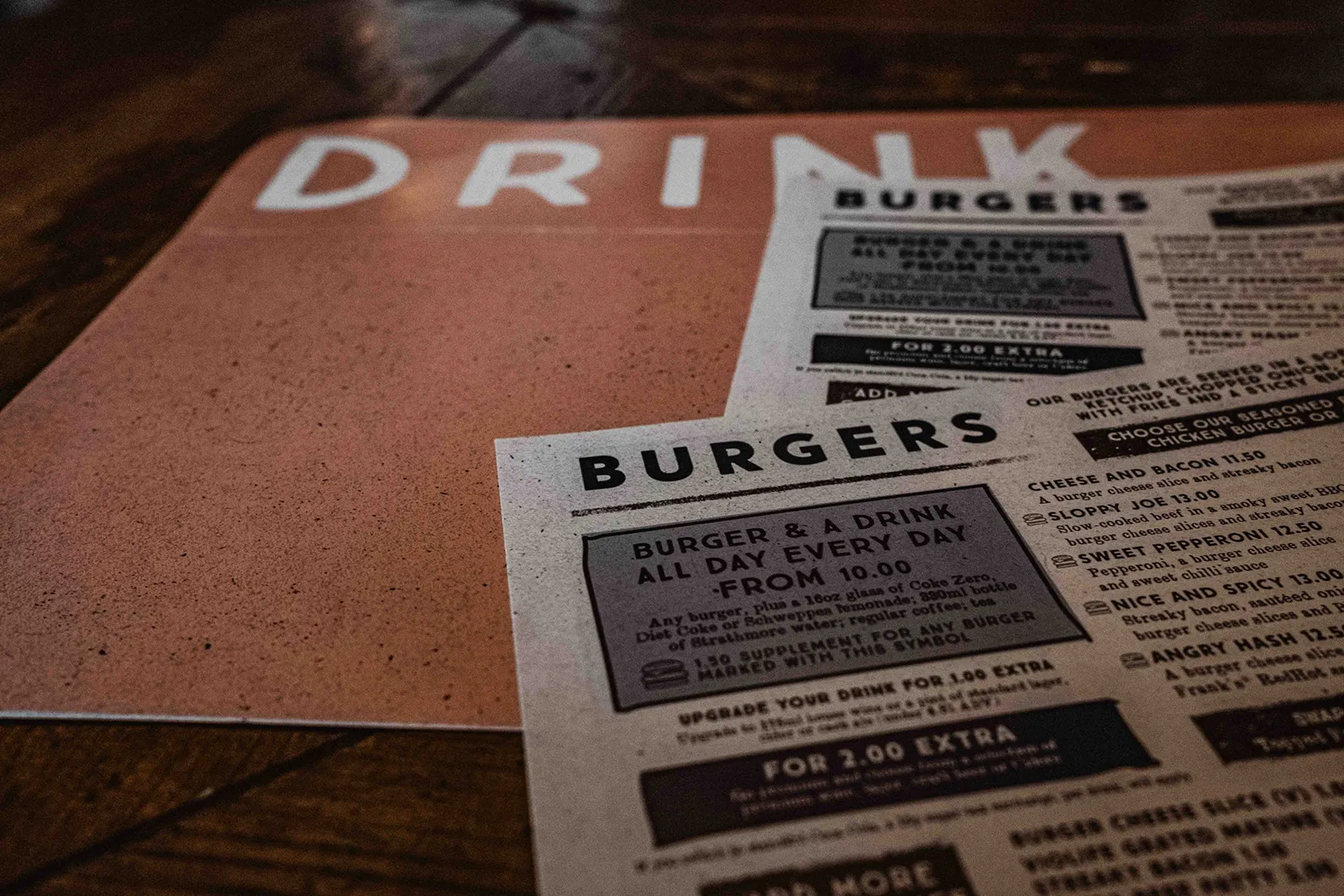
- Good example: A fine dining restaurant using just five clearly defined sections—Small Plates, Mains, Sides, Desserts, and Beverages. Everything is right where you’d expect it, and the structure reinforces the upscale experience.
- Poor example: A fast-casual spot that breaks the menu into 12 categories—some redundant (“Wraps” and “Handhelds”), some confusing (“Buildables” instead of “Bowls”). Instead of guiding guests, it slows them down and creates unnecessary decision points.
If guests have to pause and decode your restaurant menu categories, they’re more likely to bounce or default to something safe.
Keep it simple, clear, and consistent with your brand identity.
Core Principles of Effective Menu Categorization

It’s easy to think that creating strong menu categories simply means grouping like with like, but there’s a huge opportunity to guide guests’ ordering behavior and increase sales.
These core principles work on any menu, whether it’s a physical menu for a fine dining restaurant or a digital menu for a fast food establishment; they apply across the board.
Keep it simple: 5–7 main categories max
Too many choices can lead to analysis paralysis.
Aim for no more than 5 to 7 main menu categories to keep things manageable. Think in broad strokes: Appetizers, Main Courses, Dessert, Beverages, and so on.
Use familiar but descriptive labels
You don’t need to reinvent the wheel. Use terms your guests will recognize—like “Mains” instead of “Chef’s Inspirations,” or “Classics” instead of “The Lineup.”
Avoid insider terms, overly creative names, or vague labels that leave guests guessing. A little personality is fine, but don’t sacrifice clarity for cleverness.
Save the creativity for your menu item descriptions or signature dishes, not the category names.
Group items logically
Group by dish type (Tacos, Salads, Sandwiches), preparation style (Grilled, Fried, Roasted), or meal occasion (Brunch Menu, Dinner, Late Night).
Logical groupings make it easier for guests to zero in on what they want and compare menu items side by side.
Smart grouping also helps if you’re offering different menu types, such as a prix fixe menu, à la carte menu, or a tasting menu.
Each deserves its own distinct section with consistent structure. A well-designed menu that uses smart grouping and placement strategies can increase revenue by up to 35%.
Optimizing Categories for In-Person Printed Menus
The layout of your printed menus should guide diners smoothly from category to category—otherwise, they’ll end up flipping back and forth, unsure of what to order.
Here’s how to make your menu categories work harder in a physical format.
Menu layout and flow: Use the Golden Triangle to your advantage
In menu design, placement is everything, and eye-tracking research shows that diners don’t read left to right like a book.
Instead, their eyes naturally move in what’s known as the Golden Triangle: first scanning the center, then the top right, and finally the top left of the page.
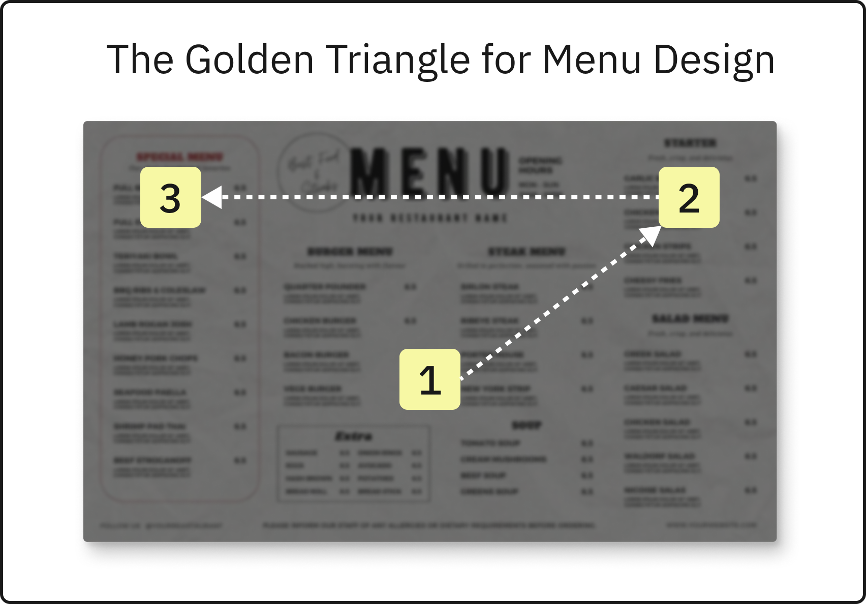
These are your most valuable zones for showcasing high-margin menu items, signature dishes, or new limited-time offerings.
Use this triangle strategically.
Start with a clear, intuitive order to your menu categories—Appetizers, main courses, Sides, and so on—but place key items from each in prime visual spots.
Within each category, remember diners also pay the most attention to the first and last two items, so don’t bury your bestsellers in the middle.
To learn more about menu design, read our article, Restaurant Menu Engineering Techniques to Maximize Profit.
Font, spacing, and headers that guide the eye
Good menu design makes it easy to scan. Use bold, consistent headers for each category, and choose fonts that are easy to read in low lighting.
Don’t crowd your menu items—whitespace is your friend. Organized spacing helps guests move from one section to the next without getting overwhelmed.
Highlighting signature items within categories
Not every dish should compete for attention.
Instead, highlight your signature dishes, house specials, or high-margin items using boxes, icons, or subtle color shifts.
Even within a category, the first and last items tend to get the most attention, so place your stars accordingly.
When done right, your printed menus should feel effortless to navigate and aligned with your brand.
The goal is to make decisions feel easy and natural without guests even realizing they’ve been guided.
Now let’s look at techniques to improve your online menus.
Optimizing Categories for Online Menus

Your online menu isn’t just a digital version of your printed menus.
When customers scroll, tap, and click instead of flipping pages, the structure and labeling of your menu categories will need a different approach.
Here’s how to do that.
Mobile-first considerations: layout, and visibility
Most diners browsing your restaurant website are on their phones.
That makes clear menu categories more important than ever.
Make sure your online menu layout is designed to be mobile-friendly so categories stack can be viewed in a clean, scrollable format that’s easy to browse on smaller screens.
Keep your menu categories short, specific, and easy to scan.
Avoid vague labels or grouping too many menu items in one section—smaller, clearly defined sections help diners find what they’re looking for faster.
Leverage real-time updates to test and refine category performance over time
Unlike a physical menu, your online menu can be updated on the fly. Use that flexibility to experiment.
Highlight different signature dishes, rotate in limited-time offers, or try new names for underperforming menu categories.
Track the impact and keep refining; it’s an effective way to see what’s working and what isn’t without redesigning your entire menu.
Specialty Categories That Boost Sales
Not every menu category needs to be a permanent fixture.
Be strategic by rotating themes—like limited-time offerings, seasonal sections, or special events—as well as permanent lifestyle categories for dietary restrictions (like gluten-free or vegan). This can drive curiosity and help diners discover new favorites.
Limited-time offers, seasonal specials, and “Staff Picks”
Creating a category just for limited-time offerings or rotating specials is a proven way to drive interest.
Label it clearly—“Seasonal Favorites,” “Just Added,” or “Staff Picks”—and feature new menu items, seasonal ingredients, or creative tests you’re running.
These categories keep your menu feeling fresh and loyal regulars engaged with exciting menu changes.
Dietary-focused categories: gluten-free, vegan, keto, etc.
Diners with dietary restrictions or specific goals appreciate when they don’t have to hunt through the entire menu to find something they can eat.
A dedicated section like “Gluten-Free Menu,” “Plant-Based Options,” or “Low-Carb Picks” makes the experience smoother and can result in stronger word-of-mouth with communities that value accessibility.
Combo and bundle categories to increase order value
If you offer prix fixe menu deals, family meals, or curated bundles ( for example, “Burger + Side + Drink” or “Taco Trio”), break them out into their own section.
This encourages guests to explore higher-value menu items while streamlining choices. Bundle categories also work great in takeout and delivery settings, where value and speed drive decisions.
Done right, these specialty sections are a helpful way to introduce variety, showcase unique offerings, and turn casual diners into repeat guests.
Common Mistakes and How To Avoid Them

Even the best menu categories can miss the mark if they’re poorly executed. Here are some of the most common pitfalls and how to sidestep them.
Too many categories or too few
Packing your menu with 12 or more categories overwhelms diners and increases the chances they’ll skip sections entirely.
On the flip side, cramming everything into two or three broad categories makes your menu items harder to navigate.
Aim for that sweet spot of five to seven primary menu categories, then use subcategories or special callouts to offer more variety without chaos.
Overlapping items between categories
It might be tempting to list that same salad in “Entrees,” “Vegetarian,” and “Light Bites,” but too much repetition creates clutter.
If a dish truly fits in more than one place, choose the most logical home, or mention alternative options in the description.
Consistency is key for a smooth ordering process.
Using confusing or clever names without explanation
Creative naming can reinforce your brand identity, but it shouldn’t come at the cost of clarity.
Labels like “Chef’s Mischief” or “Buildables” might amuse regulars but leave new guests scratching their heads.
Frequently Asked Questions About Menu Categories
How many menu categories should a restaurant have?
Most restaurants perform best with 5 to 7 main menu categories. It’s enough to give diners a sense of variety without overwhelming them.
If you have a large number of menu items, consider using subcategories or visual dividers to help with organization, especially on printed menus.
Should online menus use the same categories as printed ones?
Not exactly. Your online menu should reflect the same core structure but be optimized for scrolling, tapping, and mobile readability. A digital menu offers more flexibility in how you present and update your menu categories.
For example, you might highlight limited-time offerings or organize your online menu differently based on what performs best in a delivery context.
What’s the best way to organize items that fit multiple categories?
Choose the most intuitive home for each item based on what your target audience expects.
If something belongs in two places, it’s usually better to place it in one clear category and use the description to point out alternate options (like vegetarian swaps or add-ons).
How often should I change my menu categories?
There’s no one-size-fits-all answer, but a quarterly review is a good rule of thumb. Use sales data from your POS or online ordering analytics to see what’s working. Adjust categories as needed to reflect seasonal items, guest feedback, or new business goals.
Your Menu Categories Should Do More Than Organize
Your menu categories are one of the most powerful tools you have to influence what guests order.
Use them intentionally, and your menu won’t just look better—it’ll perform better, too.
Contact ChowNow to learn how you can optimize your menu categories for commission free Direct Online Ordering on your Restaurant Website.