Restaurant Website Best Practices With Examples

A great dining experience starts long before someone walks through your door. Nearly every customer journey begins with a search on Google, then a scroll through several restaurant websites before something catches their eye.
If your site is clunky, hard to navigate, or missing basic features like a prominent online ordering button, your potential customer will bounce because diners have little to no tolerance for friction or confusion when they’re looking for food.
62% of diners have been discouraged from ordering takeout or delivery because of a poor restaurant website experience.
Too many operators make the mistake of thinking their restaurant’s website is more like a business card rather than the first step of the customer journey.
It’s where potential customers decide if they trust you enough to place an order, reserve a table, or recommend you to a friend.
A well-designed website can make that decision easy by showing off your great food, smoothly guiding customers to place an order, and making your restaurant the place they want to be.
In this article, we’ll cover:
- What makes great restaurant websites
- Real-world restaurant website examples
- Practical tips to turn your website traffic into customers
Let’s start by revealing why every restaurant needs a website if they want to stay competitive and relevant.
Why Your Restaurant Website Matters
When someone hears about your restaurant, their first instinct will always be to look you up online first.
77% of diners visit a restaurant’s website before they dine in or order takeout or delivery.
Ignoring this static and treating your website like it’s only a digital handshake means you’d be missing a huge opportunity to convert website traffic into paying customers.
Strong restaurant websites should do three things:
Boost Visibility in Search Engines
A well-built restaurant website improves your chances of showing up when people search for restaurants in your local area.
If your site is easy to navigate, fast, and has rich content, it improves your search engine optimization (SEO), making it more likely your website will rank well.
Increase Direct Online Sales
Your online ordering should be easy to find and use on your website. Relying solely on third-party platforms splits your traffic and gives away control of the customer experience.
Build Trust with Customers
People want to know what to expect before they show up. A well-designed website with updated hours, a clean menu, and high-quality images builds confidence and makes your restaurant stand out.
If your website feels neglected, it’s not just a bad look—it’s a missed opportunity to connect with the people already looking for what you offer.
Now let’s dive into restaurant website examples and best practices, starting with one of the most common mistakes operators make: spreading their digital presence across too many sites.
Stick With One Main Website
It’s surprisingly common for restaurant owners to split their digital presence, including:
- Third-party online ordering pages
- Separate catering site URLs
- Old landing pages that never got taken down
The result is confused customers, diluted traffic, and a weak performance on search engines.
Here’s something you should always keep in mind when working on your website: Google rewards clarity.
When your website houses your menu, hours, location and ordering, it becomes the single source of truth for your business. That unified authority sends the right signals to Google, improving your SEO and bringing in more organic traffic.
But when you scatter your presence across multiple URLs or push potential customers to third-party pages, you lose that momentum.
You also lose the opportunity to keep customers immersed in your brand experience from start to finish.
A great restaurant website keeps everything in one place where you control the layout, the images, the tone, and the flow. It keeps things simpler for customers and more strategic for you.
Make Online Ordering Easy
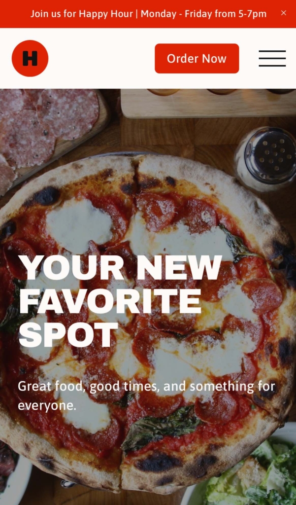
Make your online ordering button impossible to miss.
For example, in this restaurant website example you can see the prominent “Order Now” button in the top right corner.
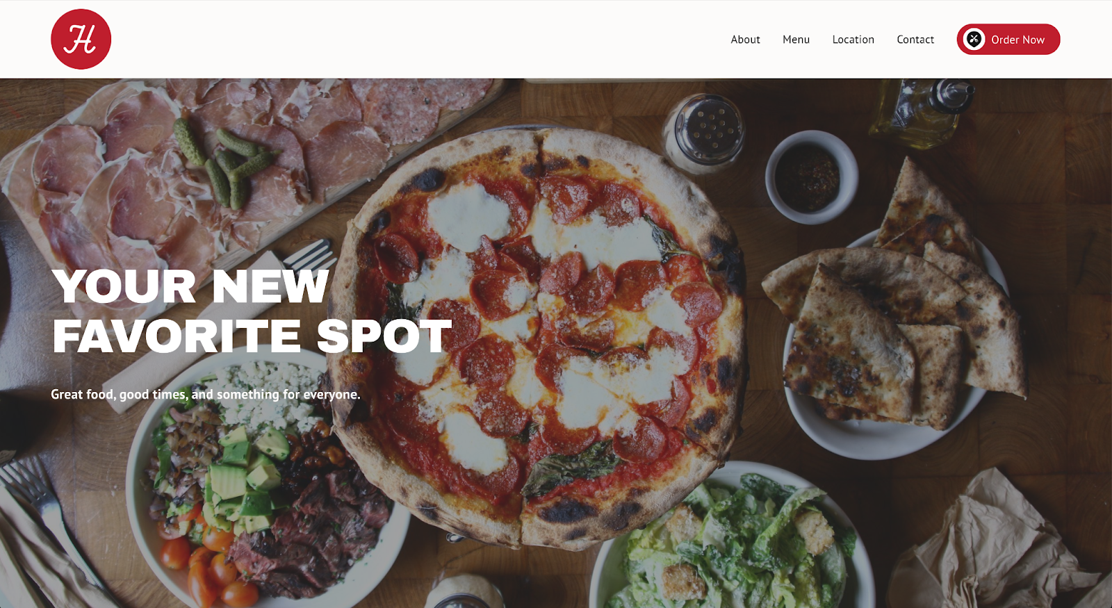
Placing it at the top of your navigation bar, keeps it consistent across every page.
Also, make sure it works just as well on mobile as it does on desktop. 56% of diners say mobile-friendly restaurant websites are very important.
For example, this is the mobile version of the restaurant website. Notice that it stays recognizable and on brand with a distinguishable “Order Now” button.

One well-placed online ordering button is all you need.
Multiple “Order Now” buttons scattered across your website can confuse visitors and slow them down.
Stick to a single clear path that leads directly to your online ordering system and customers won’t second guess which button they need to push to place their order.
This kind of simple, user-friendly experience makes a big difference.
It keeps potential customers from bouncing, speeds up the path to purchase, and reinforces the idea that your restaurant is ready to serve—quickly, clearly, and without the runaround.
Promote Your App or Rewards Program on Your Restaurant Website
If your restaurant has a mobile app or a rewards program, your website should be actively driving signups.
Here is how to do that.
Highlight why diners should download your app
Add clear links or visual prompts throughout your restaurant website that guide diners to download, whether that’s through a banner or a a callout on the website.
Think about what makes the app useful:
Is it faster than ordering through your site?
Does it remember past orders?
For example, this is a prompt highlighting that downloading the app makes ordering faster and easier.

Show the benefits clearly and connect downloading the app to real value, not just another place to order, but a smarter, more personal one.
Share the value of your rewards program
Loyalty programs only work if people know they exist. If your restaurant offers loyalty rewards, your website should communicate that without over explaining.
A quick mention during checkout, a note near the menu, or a visual on your website is often all it takes.
This example calling out a restaurant’s Rewards Program tells diners what’s in it for them if they sign up, and they can start earning on their first order.

Let users know exactly what they’ll get when they join and make it ridiculously easy to do so.
The key is to position your program as part of the overall customer experience, not an extra chore.
Keep it simple: earn rewards, save money, come back.
Loyalty isn’t automatic. It’s earned through consistent value and visibility.
If you’ve built a program or invested in an app, make sure your website is helping you get the most from it.
Keep Your Menu Embedded, Accurate, and Easy to Navigate
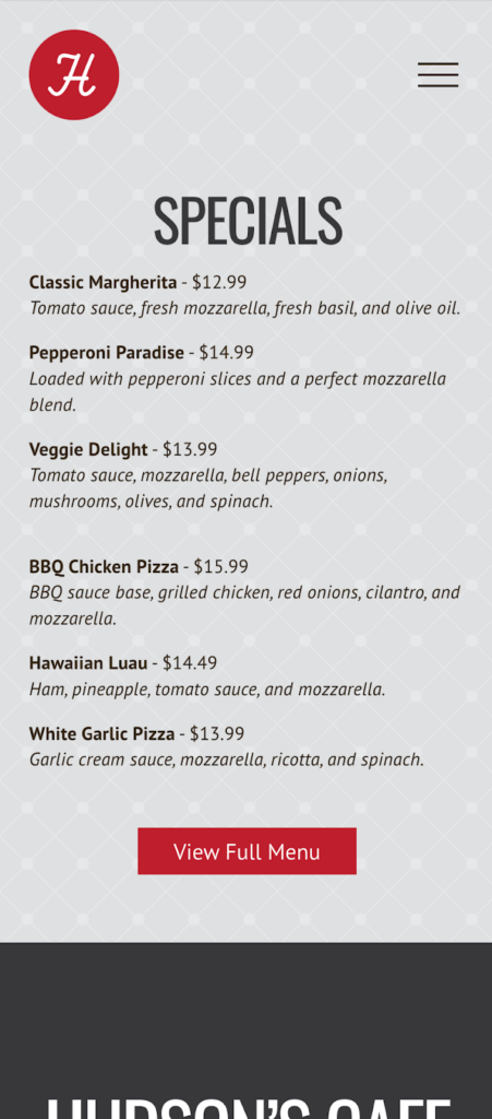
Most diners visit your restaurant’s website to check out your menu, so make it easy to find and read.
Many restaurant owners make the mistake of forcing customers to download a PDF.
The best restaurant websites embed the menu directly on the site, so it loads fast, works on mobile, and keeps diners focused on your brand.
Below is an example of an embedded menu on a website. Notice the intuitive navigation, consistent branding throughout the experience, and how the Order Online button is always right there when customers are ready to place their order.

An embedded menu also helps with search engine optimization. Search engines can’t scan PDFs or external pages as easily, but they can read your menu if it is part of your website.
That means your dishes, ingredients, and descriptions help you show up in local searches, especially if you’re emphasizing things like local ingredients or dietary options.
Your website should be consistently updated and accurate at all times as well.
Outdated hours, missing prices, or mouth-watering images of dishes no longer available are an easy way to lose potential customers.
If a customer sees one price on the menu but it’s different when they get to check out, they’ll likely leave your site because they don’t want any more surprises when their order arrives.
Consistency builds trust, and when your restaurant’s website is always accurate, you’ll create more loyal customers.
Make Your Restaurant Website Mobile Friendly
Most customers viewing your restaurant’s website are not on their laptops.
They’re sitting on the couch at home, riding around in a car with friends or family, or even standing outside your restaurant trying to decide if they want to go in.
That’s why the best restaurant websites are built with a mobile-first responsive design mindset, not just resized to “work on mobile.”
Below are restaurant website examples in desktop and mobile.
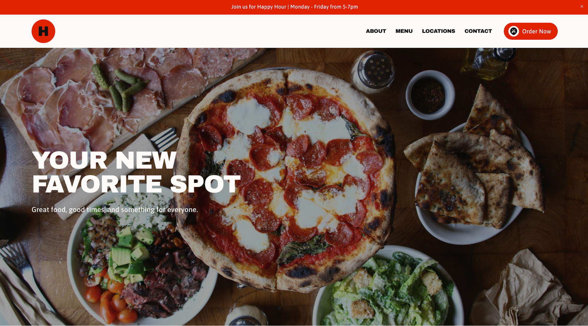
It’s the exact same feel with clear navigation and good use of white space to give customers the clean, user-friendly experience they expect.
Your mobile website should:
- Load pages quickly
- Be easy to tap or scroll through the menu
- Have clear call to actions
- Be easy to read without zooming
For example, this is a mobile menu that’s user friendly and leaves no room for questions about what customers should do next.
An uncomplicated mobile experience with well-placed features will help you connect with more customers and keep them engaged long enough to act.
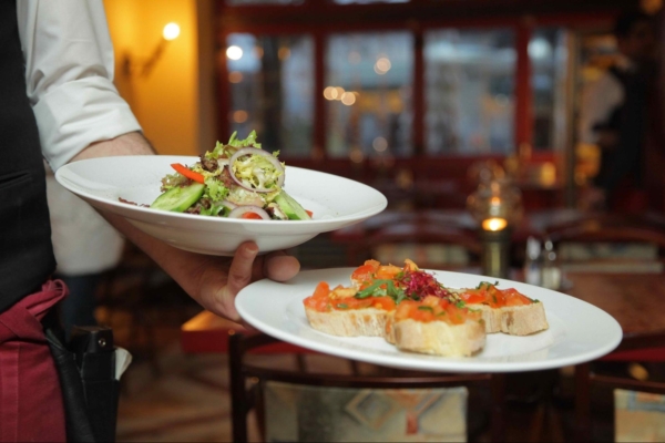
Use Photos That Reflect Your Brand
Photos aren’t decorations on restaurant websites; they’re decision-makers.
Before a word gets read or a menu gets opened, people are scanning for images that match their expectations.
45% of diners specifically look for photos when visiting a restaurant’s website.
The best restaurant websites use high-quality images to showcase not just the food, but the feeling of dining there.
For example, the image in this restaurant website example shows the process behind the food the restaurant is serving.
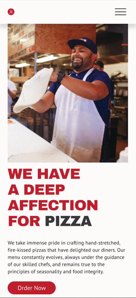
The visual appeal conveys a fun, friendly atmosphere with high energy, so customers know what to expect before walking through the door.
The goal is to reflect your restaurant’s story, not show just the food.
And don’t use stock food photos.
They make your website look generic, eroding customer trust because your actual dishes look nothing like what’s in the photos.
You don’t need hundreds of images, just enough to showcase your vibe and support your brand identity.
When your visuals match your experience, you help potential customers picture themselves there, and that’s often the final push they need to book a table or place an online order.
Common Mistakes to Avoid
Even the best restaurant websites can fall into a few traps that cost them traffic, orders, and trust.
These mistakes are easy to make, but also easy to fix once you know what you’re looking for.
These are the most common pitfalls that trip up restaurant owners, and how to avoid them.
Multiple URLs or outdated landing pages
Spreading your digital presence across old links, subdomains, and third-party ordering sites confuses site visitors and waters down your visibility on search engines.
Stick with one main domain, and remove or redirect anything that no longer serves your business.
No clear online ordering button
Your online ordering button should be visible the second someone lands on your homepage, and you only need one.
Scattering multiple buttons across your website creates hesitation because guests aren’t sure which one to click.
One clear button = one clear path. No confusion.
Websites that don’t match your branding
A simple restaurant website is fine, but it still needs personality.
Only use customizable templates that allow you to add your colors, logo, and photos to maintain your brand identity. A stylish combination of your real space, menu, and vibe play a large role in building trust with diners.
Remember: consistency builds trust, and a restaurant website that stays on brand feels like an extension of your physical restaurant—something customers recognize.
Treating your website like a static brochure
Too many operators see their site as something to set and forget, not as a functional, live, and interactive tool that can be used to convert diners, drive orders, and increase customer loyalty.
If your restaurant website is outdated or is just a list of hours and a phone number, it’s not doing its job.
Restaurant Website Examples: Frequently Asked Questions
What makes a restaurant website great?
A great restaurant website is easy to navigate, mobile-friendly, visually appealing, and has a clear online ordering button. It should reflect your brand identity and guide visitors toward placing an order or booking a table without friction.
Why is my restaurant website important?
77% of diners check a restaurant’s website before ordering or visiting. A strong site builds trust, drives direct orders, and helps you stand out in search results—making it one of your most valuable marketing tools.
How can I make my restaurant website mobile-friendly?
Use responsive design, fast load times, and clear navigation. Make sure your menu is easy to scroll through, buttons are easy to tap, and calls-to-action like “Order Now” are visible without zooming in.
What are common restaurant website mistakes to avoid?
Avoid having multiple outdated URLs, hiding your online ordering button, using visuals that don’t match your brand, or treating your website like a static brochure instead of an active sales and engagement tool.
How do I showcase my menu on my restaurant website?
Embed your menu directly on your site instead of using PDFs. Embedded menus load faster, are mobile-friendly, and help with SEO because search engines can read your menu items and descriptions.
How can I use my restaurant website to promote my rewards program or app?
Highlight app benefits such as faster ordering or remembering past orders, and make sign-ups simple. Show rewards program perks on checkout pages, menu sections, or in banners to encourage diners to join.
What types of photos should I use on my restaurant website?
Use high-quality, authentic images of your dishes, restaurant space, and team. Avoid generic stock photos and choose visuals that match your real dining experience to build trust and connection with potential guests.
How can I improve online ordering on my restaurant website?
Place one prominent “Order Now” button in your navigation bar so it’s visible on every page. Keep the ordering process simple, and ensure it works seamlessly across both desktop and mobile devices.
Should my restaurant have multiple websites or URLs?
No. Keep everything under one main website to avoid confusing customers, improve your SEO, and maintain consistent branding across all customer touchpoints.
What are examples of the best restaurant websites?
The best restaurant websites have consistent branding, a single clear “Order Now” button, embedded menus, mobile optimization, and engaging visuals that tell the restaurant’s story while making it easy to order or book a table.
Your Website Should Work as Hard as You Do
Restaurant websites today are the starting point of the customer journey, which means its job is so much more than just an online menu.
It acts like a virtual host, welcoming guests, showcasing your brand story, and steering customers to either dine in or place an order online.
By applying these proven best practices to your own website, you can make your website work as hard as you do.
Contact ChowNow, and we’ll build you a customizable Restaurant Website powered by Squarespace, complete with your colors, logo, and photos to attract more customers and drive direct orders.